Design system implementation
Overview
The transaction matching module of the financial close platform had three challenges to address.
- A dated interface out of touch with modern standards, which failed to show the product's powerful features in the best light.
- Functionality split across three clients: a web client and two thick clients, taking up time to navigate between programs.
- The fast-approaching death of Flash, a key component of many interface elements.
An initiative was begun to address all three at once, converting first the web client, then the thick clients, to a new, Angular web platform.
Process
The first step was taking inventory of all pages to be converted, sorting them into a new navigation hierarchy, and syncing with the engineering team to determine our priority list.
Once our backlog was created, we synced our timeline to run just ahead of engineering team's sprint schedule, and then began our own cycle:
-
Design
Converting the functionality of each page to fit within the product's design system, whether through applying existing components or creating new ones. This included low-fidelity rapid-iteration component mockups and testing with internal, customer-facing subject matter experts.
-
Testing
With the fast-paced development cycle, we conducted low-fidelity testing with internal, customer-facing subject matter experts.
-
Delivery
Design springs happened ahead of engineering, with each batch of pages being delivered to the product owner for review and integration into the team backlog.
-
Revision
Time was also reserved for revisions, as the discovery of technical limitations during the rapid development cycle required changes to certain patterns.
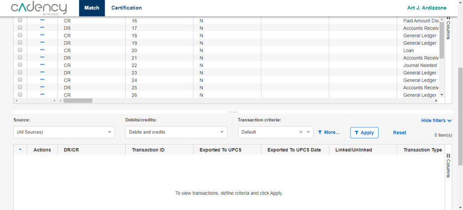
Screens from the Axure prototype used in user testing for the transaction matching screen.
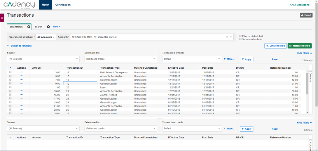
Matching screen
The transaction matching screen was the most difficult challenge during the project. It required complex filtering, a full toolbar of actions to be taken on the table, and two tables worth of data to be compared and contrasted side-by-side.
There was one key factor that made all of this more difficult: to meet web accessibility guidelines, we had to increase the font-size from 10 to 14px. While this was a win for accessibility, it inherently reduced the amount of data that could be displayed on screen at once.
Information density especially came up as a concern during user testing. The need to scroll to view the two tables was the most frequent complaint; as a result, I made a few key changes:
- Carefully pruning the options in the toolbar, and moving the rest into contextual "more" menus
- Allowing the user to fully collapse and hide certain toolbar rows once their filters were selected
Results
Reduced clicks to access features
Increased compliance with design system
Improved WCAG accessibility
Full release before death of Flash
We set out at the start of this project to not only navigate the death of flash, but to make the product easier to navigate, easier to read, and to come in line with modern UI standards.
By the end of the project, the matching platform came in line with the design of the rest of the application, including accessibility, consistent layouts and design patterns, and improved navigation. The launch went smoothly, the new client released with no loss of functionality and many improvements in the readability of the most complex features. Furthermore, the module was set up for future expansion by working within an established design system that sped up the development of new features going forward.