Product rebrand
Overview
In the wake of a company-wide rebranding, the application needed an update to use the newly supplied brand colors. The aim was to complete a fast, CSS only rebrand by swapping out colors on existing style sheets.
Design
Initial design work had three steps:
-
Rapid prototyping
Testing out different applications of the color palette and ensuring they met color contrast guidelines
-
Review and decision
Sorting through the remaining options to determine the best design, and any last-minute changes that needed to be made.
-
Documentation
Identifying all interface elements to be changed, the CSS classes and properties affecting them, and the hex codes to be applied.
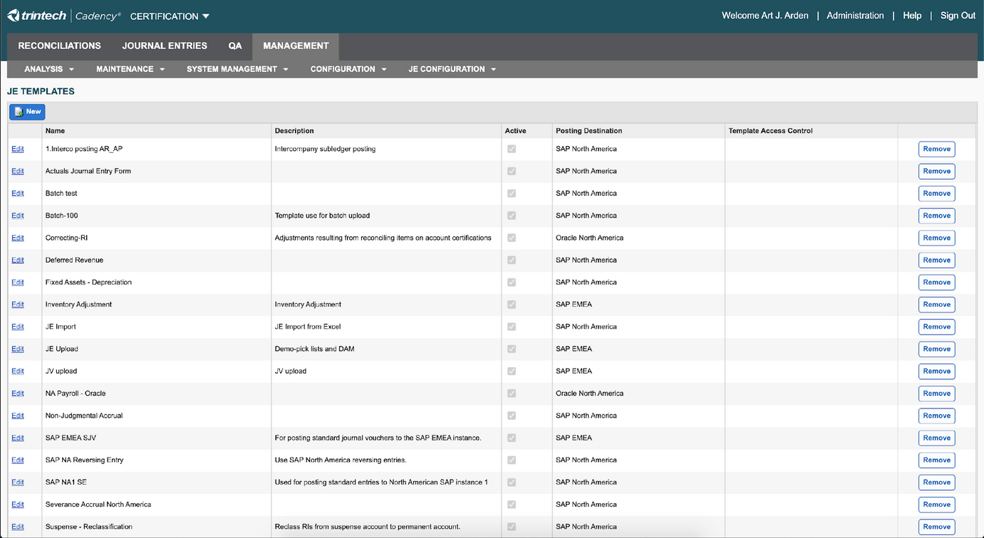
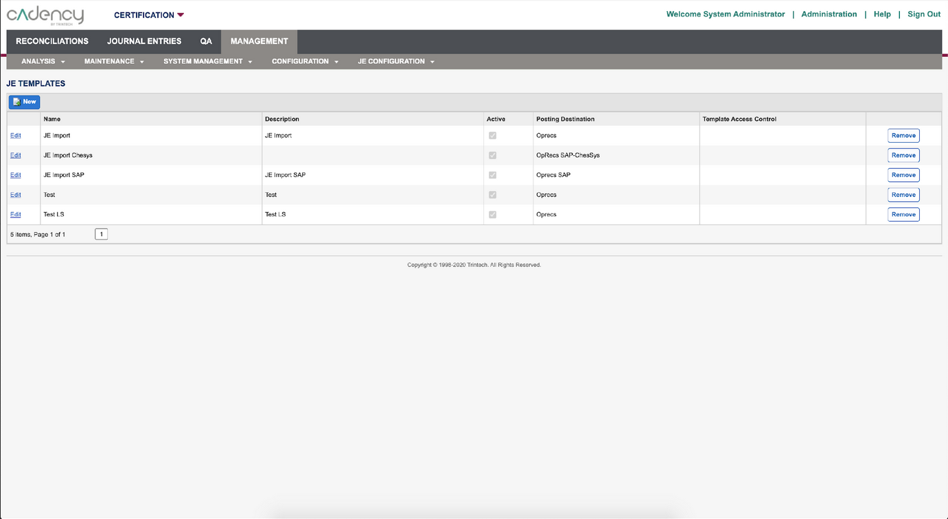
Before and after shots from the product rebrand.
Development
UX involvement did not end when we handed off the documentation; I worked closely with the developers through the entire project to troubleshoot issues such as:
- Quirks of the product's codebase preventing suggested changes from working as expected
- Identifying source stylesheets when CSS effects were split into multiple locations
- Changes having unforeseen effects across the rest of the application due to cascade behavior
Sometimes the indicated classes and changes did not work as expected due to the unique implementation of the product's libraries. In this case, alternative ways of targeting the elements needed to be developed. Sometimes the CSS was broken across multiple style sheets, and the developers needed assistance locating the appropriate one. Sometimes the change worked but had unforeseen effects across the rest of the pages due to cascade behavior, and the use of classes and ids needed to be changed to be more specific.
Results
Seamless transition in a single release
Increased brand synergy
After several sprints of review and revision, we were able to implement the change across the entire product in a single release, bringing the product in line with the new brand guidelines and increasing synergy across the customer experience.